DS Type Foundry Publications
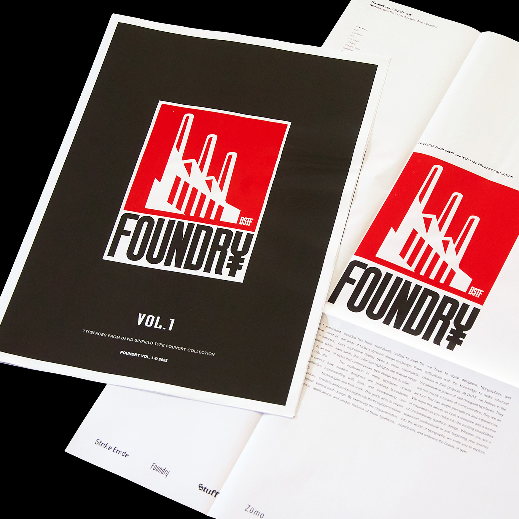
A1 Foundry Newspaper: A Collection of 3 volumes
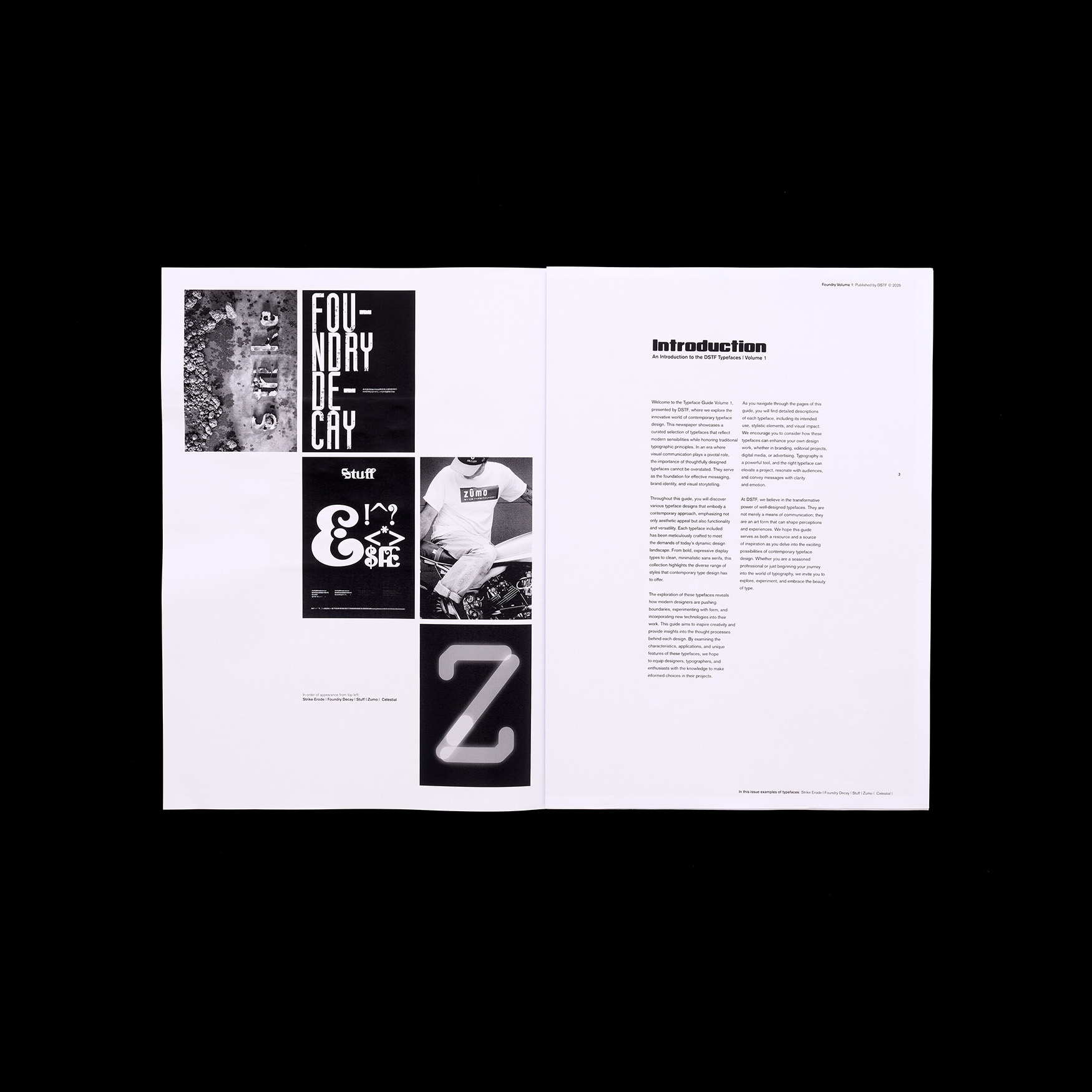
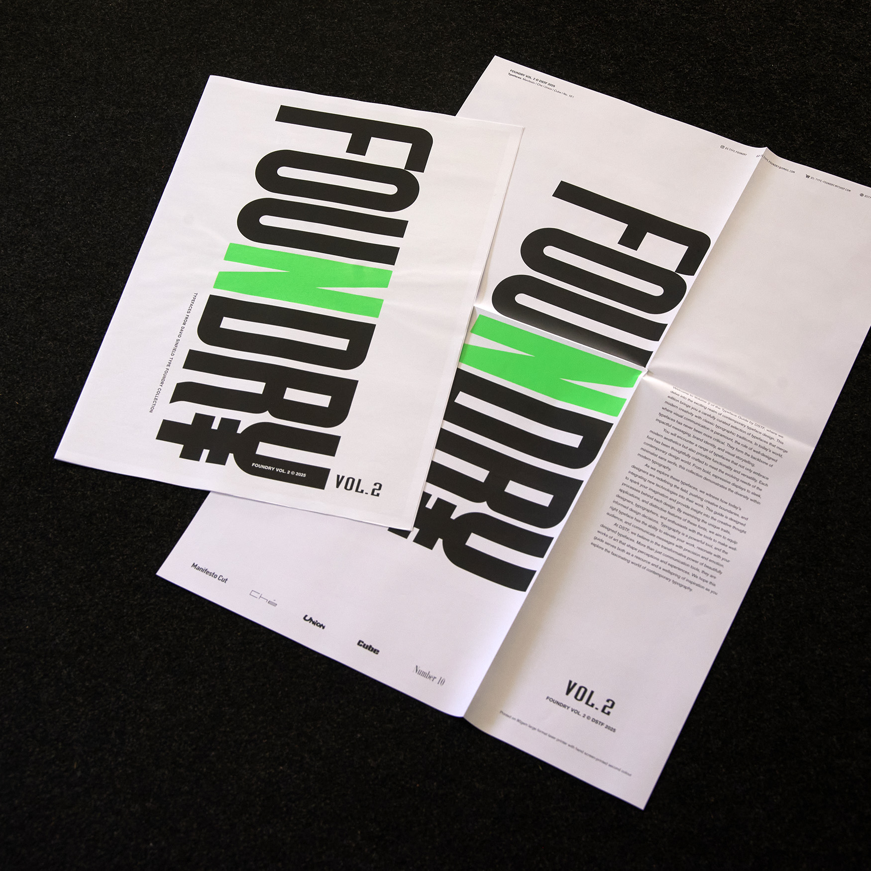
These volumes harken back to an era when reading newspapers was an integralpart of daily life, fostering a deeper connection with the written word. Printed in black and white with the front and back covers hand screen-printed in vibrant second colours. Designed and produced in an A1 format folded down to A2, these large-scale publications provide an immersive reading experience. When opened, the sheer size of the pages is striking—impressive but also impractical for cozy or crowded settings like your favourite café.
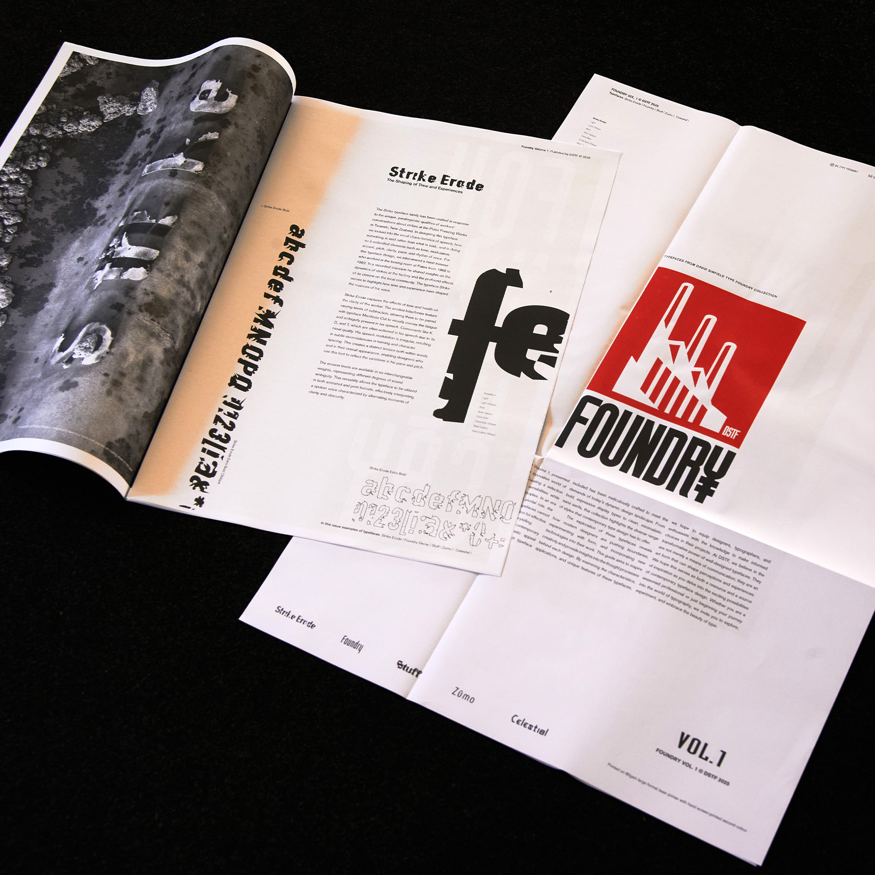
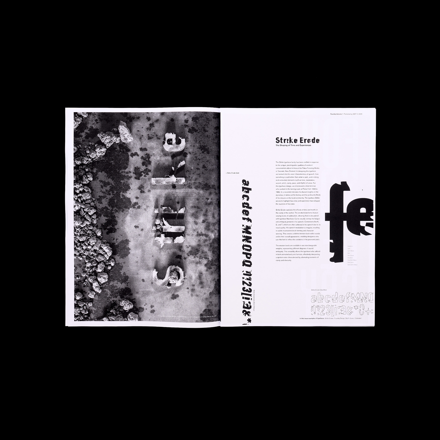
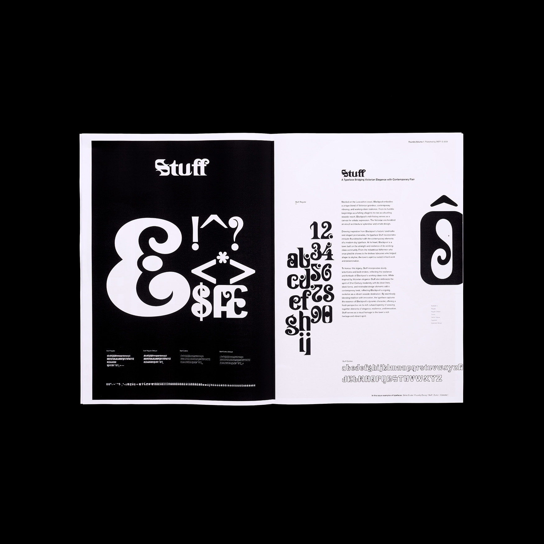
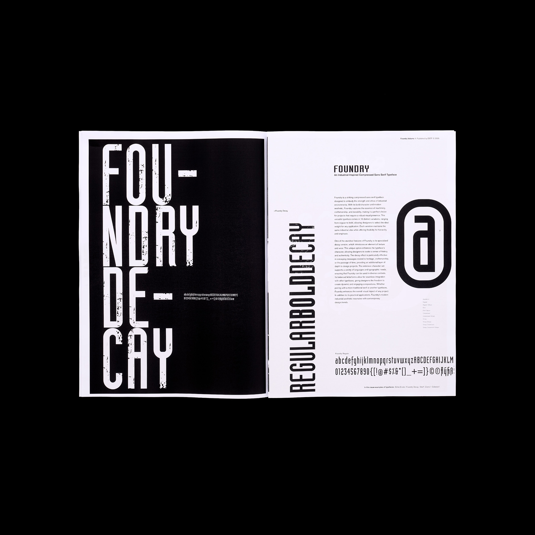
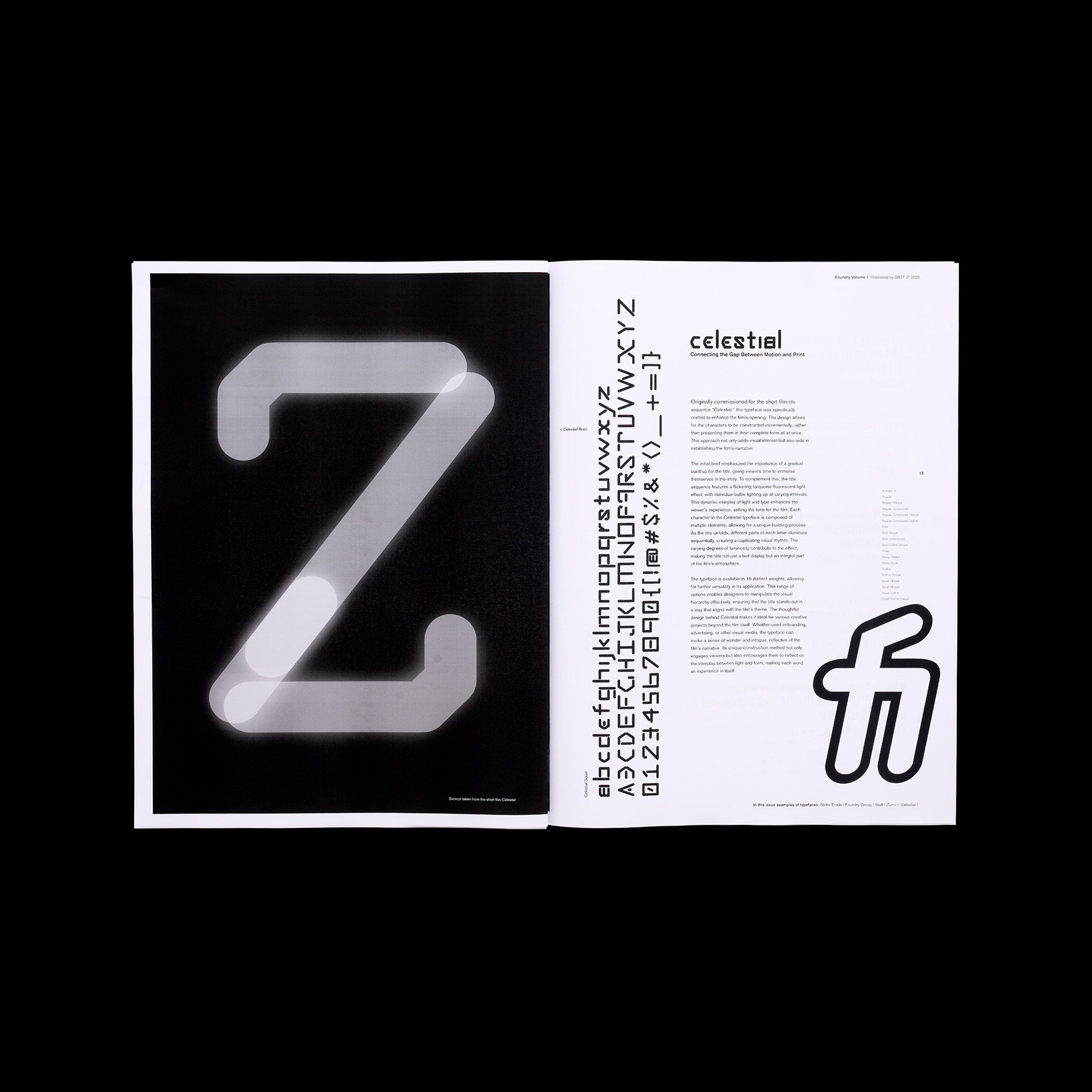
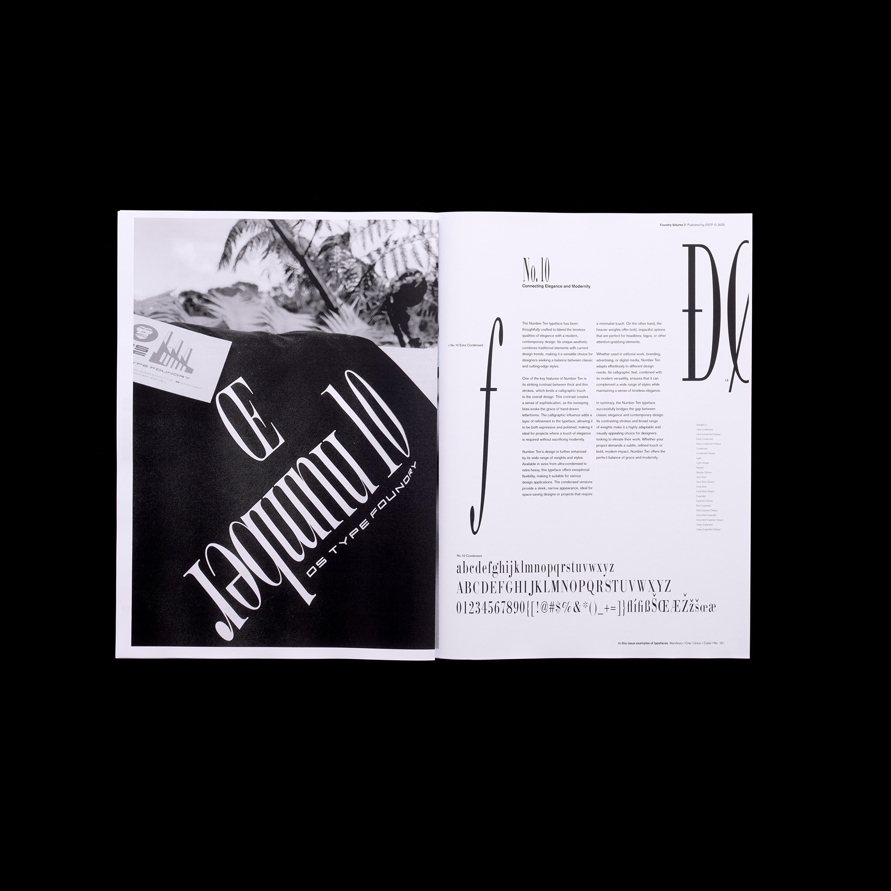
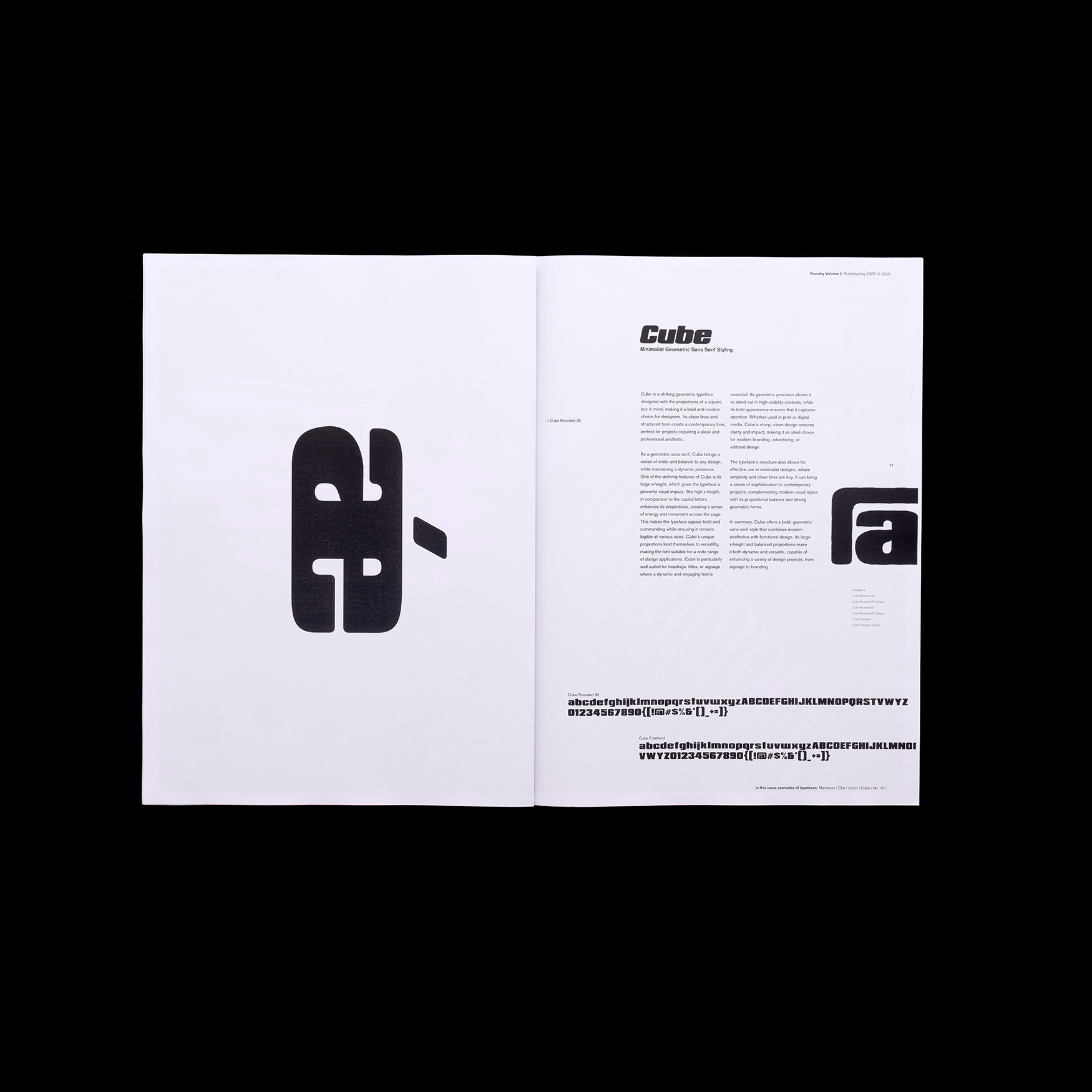
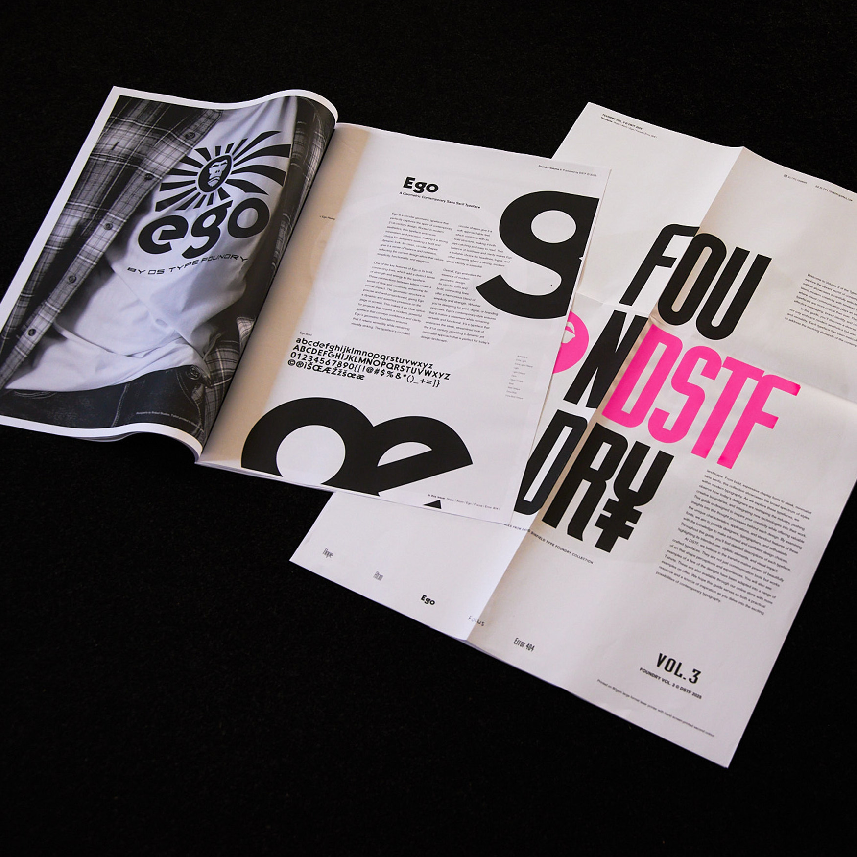
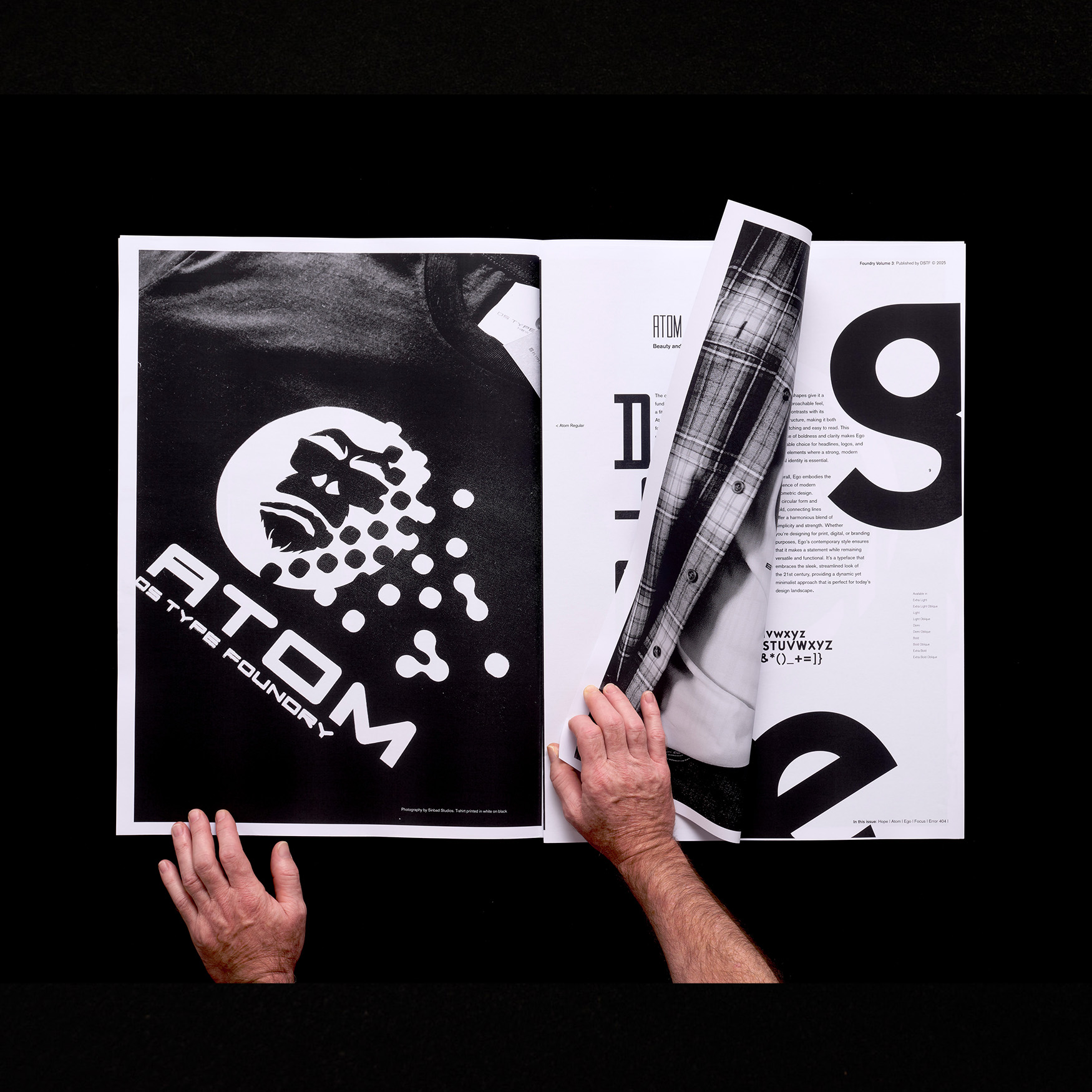
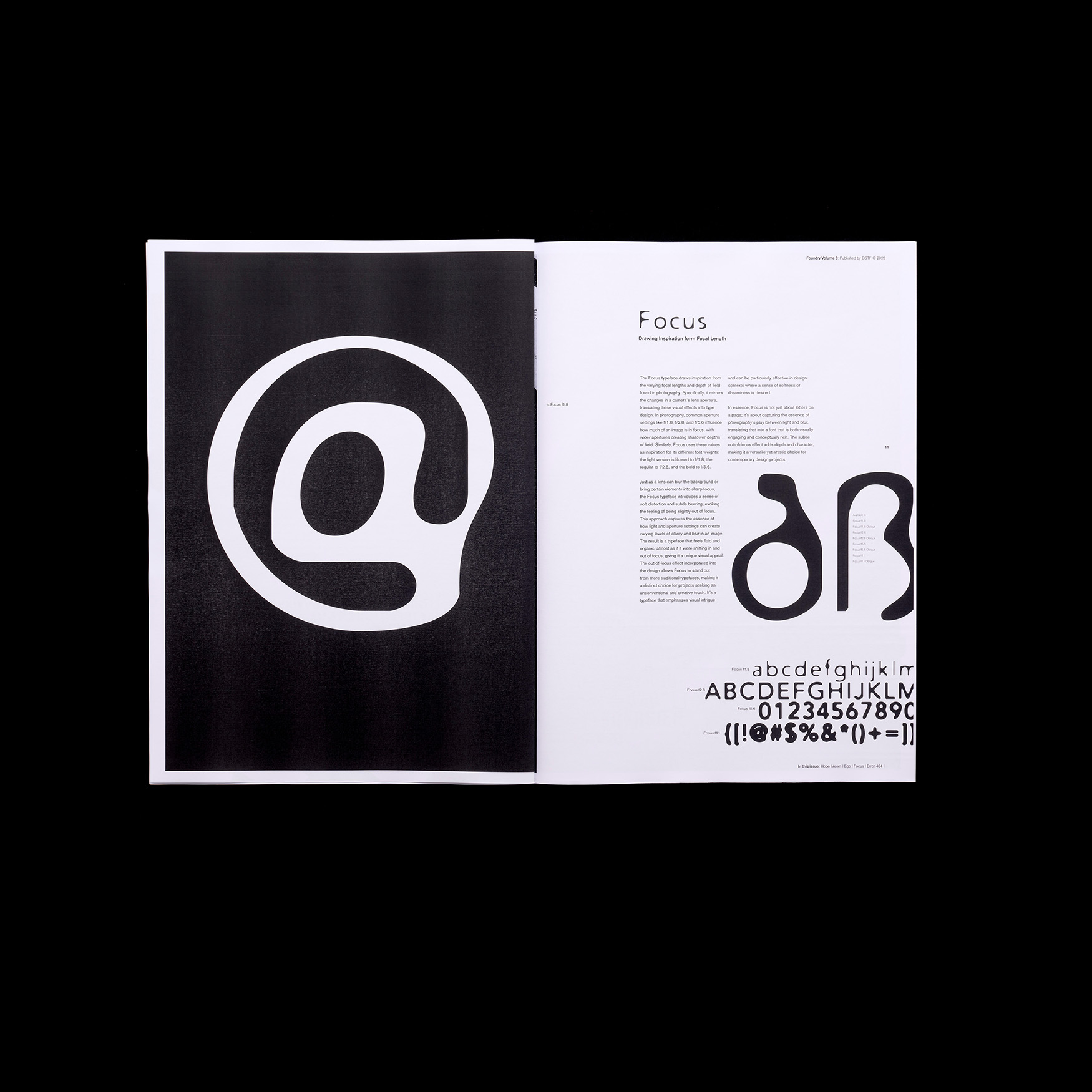
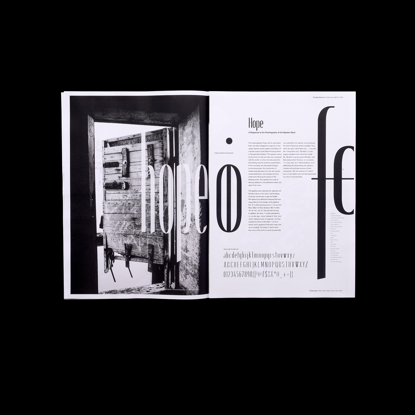
The intent behind this bold choice of format is to evoke the tactile and visual experience of engaging with a newspaper. It offers readers an opportunity to explore the typefaces not only as design elements but as functional components of a larger narrative, demonstrating their appearance and impact when used in real-world contexts like editorial layouts. Rather than adhering to the conventional type specimen booklets where typefaces are showcased in carefully arranged, small-scale samples, these volumes embrace a more experimental approach. They do not merely present the form and technical characteristics of the fonts. Instead, they explore their functionality and aesthetic in practical applications, such as advertisements found in newspapers. By breaking away from tradition, the design of these volumes provides a unique perspective on how typefaces operate in everyday scenarios, helping readers visualize their use in dynamic and varied contexts.
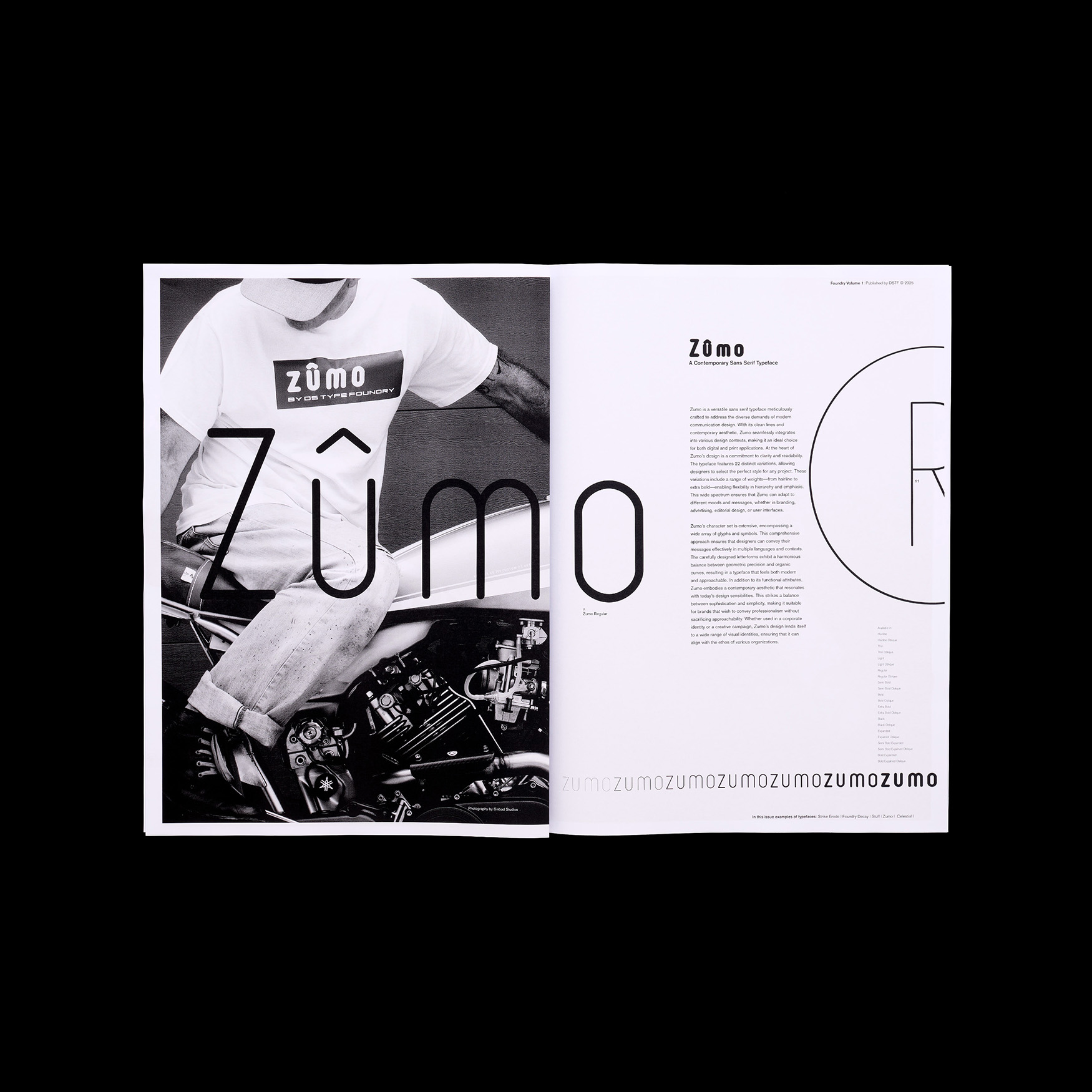
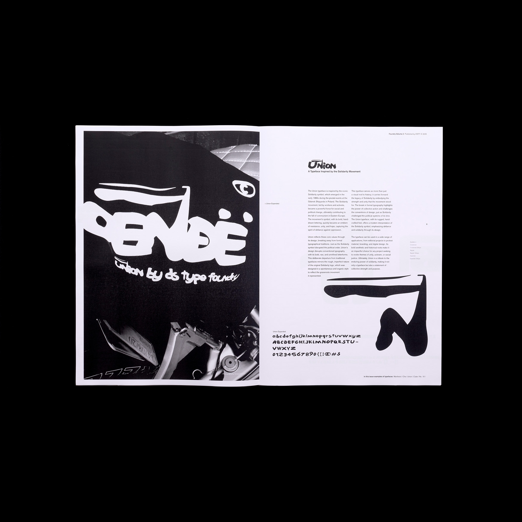
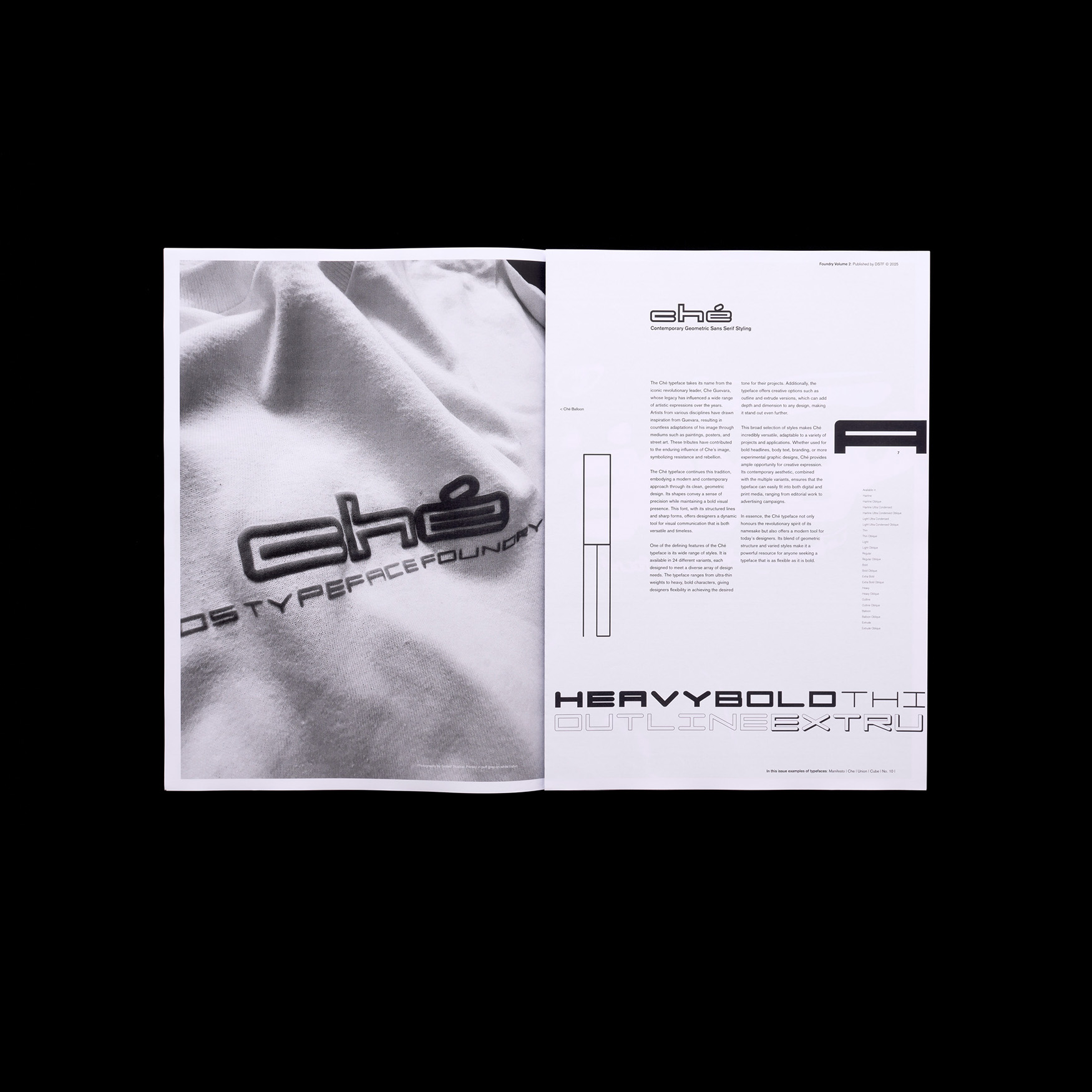
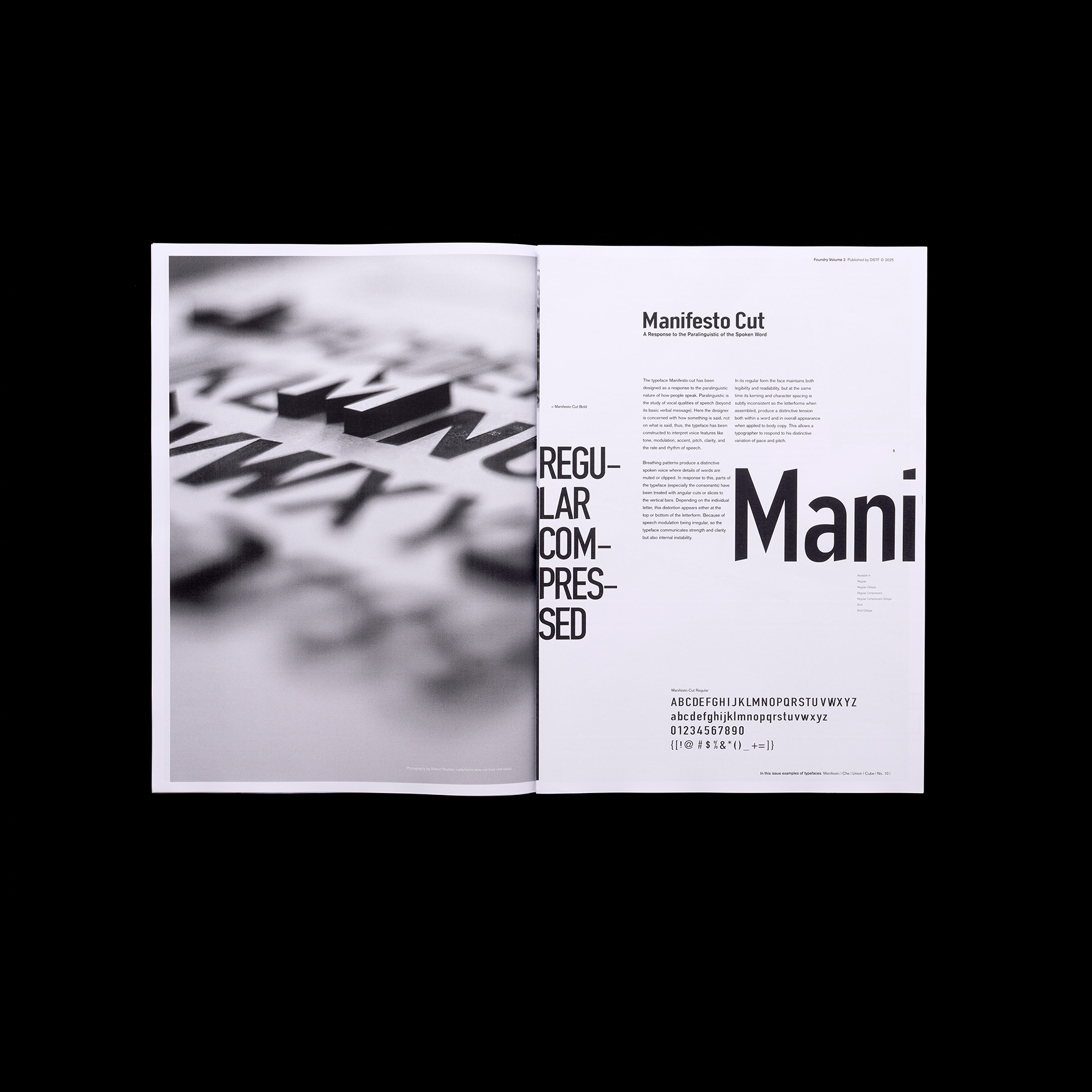
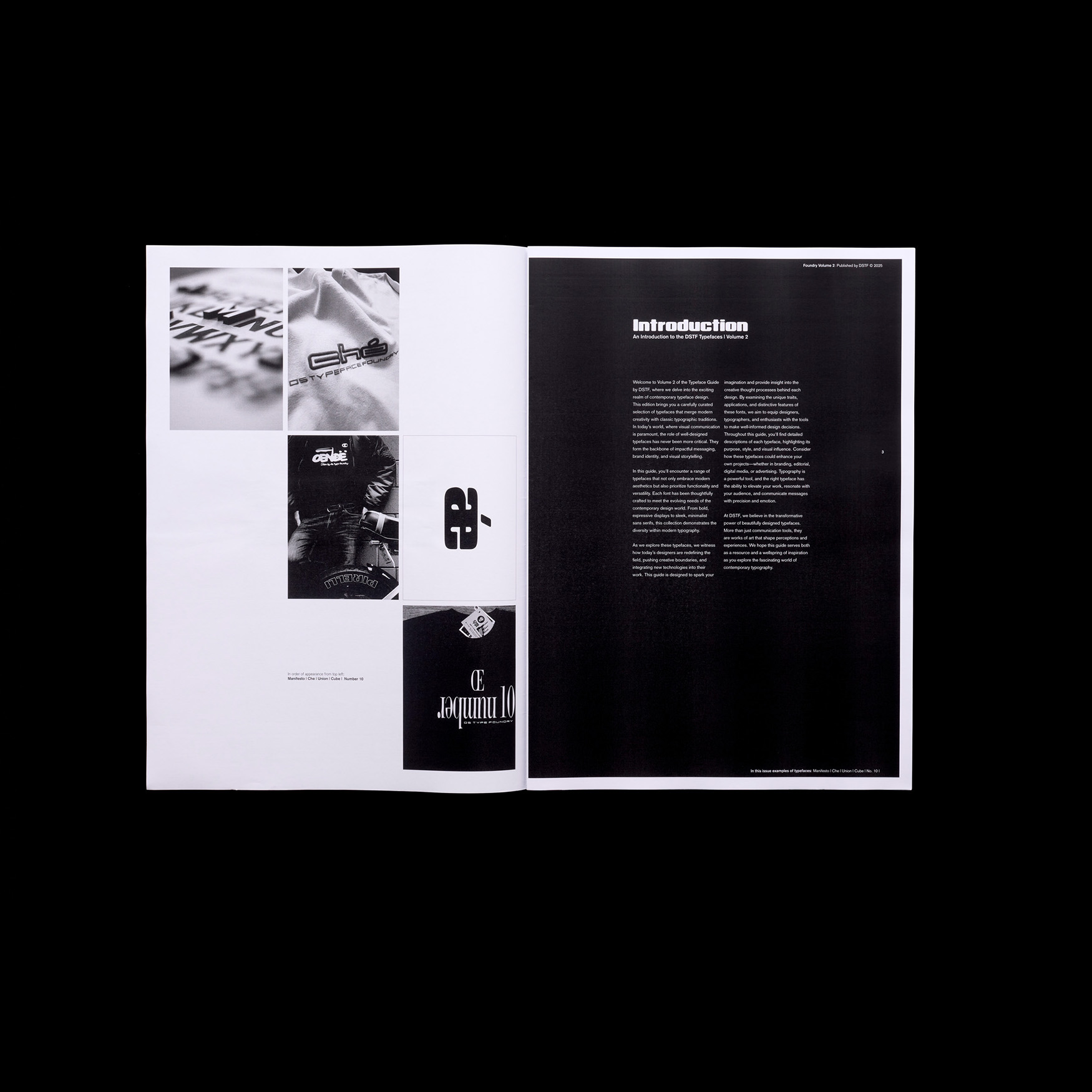
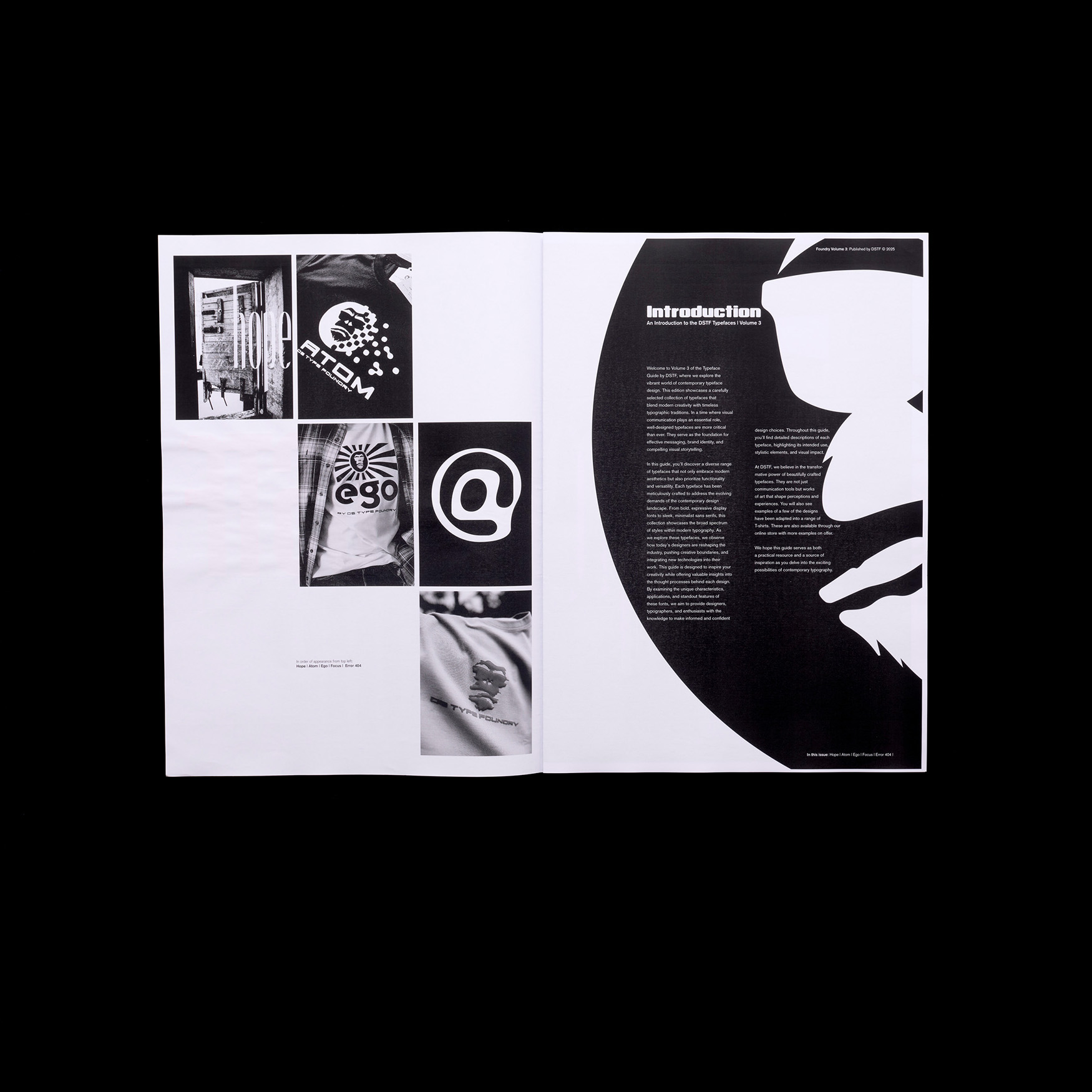
Additionally, the presentation of these typefaces extends far beyond ink on paper. The concept incorporates diverse materials and mediums, bringing the fonts to life in unexpected ways. Examples include moving images, woodcut letters, rusted steel, and even applications on T-shirt designs. This multidimensional approach not only challenges the standard format of typespecimen booklets but also redefines how typefaces can be experienced. By experimenting with these unconventional methods, it demonstrates the versatility and adaptability of the typefaces, encouraging viewers to think of typography as more than static forms confined to the page.
This innovative exploration of type design invites readers to see typefaces as living, breathing entities capable of transcending traditional boundaries.Through these volumes, typography is presented not just as a design tool but as a form of expression that interacts with its surroundings. Whether through thenostalgic lens of a newspaper or the tactile qualities of materials like wood and steel, the collection invites readers to engage with type in meaningful and unconventional ways. In doing so, it reimagines the type specimen booklet for amodern audience, offering a fresh take on how we perceive and appreciate the art of typography.